1 min read
Role- and skill-based planning: New features in Can Do
We are really pleased to present the further development of role- and skill-based planning in Can Do. The topic has...
.png?width=200&height=80&name=CanDo%20Logo%20transparent%20(500%20x%20200%20px).png)

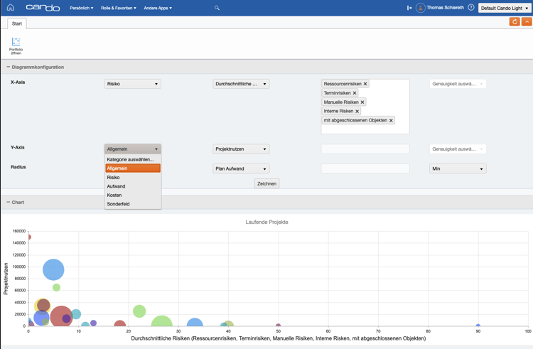
In the well-known app "Manage Portfolios" is a static bubble chart that visualizes the three values: risk, benefit (score) and effort.
Users frequently use the chart, but would like to see other criteria as well. Therefore, we have rewritten this part of the app and now offer the possibility to evaluate all axes and values extensively. This means that by adjusting the settings, many more aspects of a portfolio can be analyzed visually.
We will continue to include that combinations of values can be saved with names and shared organization-wide.
This app will be built into the existing portfolio management app and will also be released as a separate dashboard app in the standard in a timely manner.
You would like to learn more about the score? Read what a negative score is all about: "Negative Score and Bubble Chart".
As a member of the management board, Thomas is responsible for the operative management of the development including conception, design and further development of the software. He also advises customers on best practices and supports the roll-out.
1 min read
We are really pleased to present the further development of role- and skill-based planning in Can Do. The topic has...
Change Requests Are Part of Everyday Project Work – In Our Team Just as Much as With Our Clients
In many workshops or...
Decisions have to be made constantly in project and resource planning. What happens if an important project starts...