1 min read
Role- and skill-based planning: New features in Can Do
We are really pleased to present the further development of role- and skill-based planning in Can Do. The topic has...
.png?width=200&height=80&name=CanDo%20Logo%20transparent%20(500%20x%20200%20px).png)

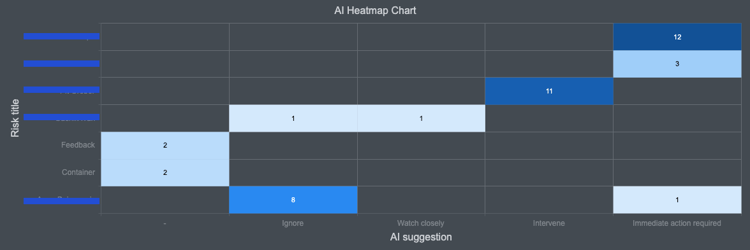
Can Do AI can analyse entire portfolios for risk and make recommendations.
The results often form the basis for decisions by project and team leaders. When this technology is applied to very large projects or entire portfolios, the system naturally spits out a lot of results. That's why we're always looking for additional ways to present the results to make it as convenient and transparent as possible for users.
In the current version, we have added a heat map below the tabular display, which visually summarises the results.
Here is an example from my portfolio that shows me that I need to check one of my employees due to overloads:
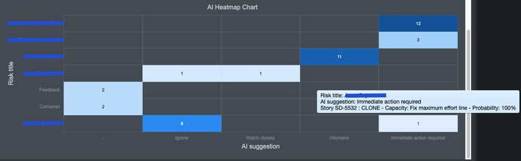
I get the details in a separate window when I move the mouse over the corresponding rectangle.
The graph reads from top right to bottom left, as the most serious recommendation "immediate action required" is in the last column and the most number in the respective column is sorted in descending order.
The graph has been implemented across the board in the software to always be visible under the tabular AI analysis.

As a member of the management board, Thomas is responsible for the operative management of the development including conception, design and further development of the software. He also advises customers on best practices and supports the roll-out.
1 min read
We are really pleased to present the further development of role- and skill-based planning in Can Do. The topic has...
Change Requests Are Part of Everyday Project Work – In Our Team Just as Much as With Our Clients
In many workshops or...
Decisions have to be made constantly in project and resource planning. What happens if an important project starts...