1 min read
Role- and skill-based planning: New features in Can Do
We are really pleased to present the further development of role- and skill-based planning in Can Do. The topic has...
.png?width=200&height=80&name=CanDo%20Logo%20transparent%20(500%20x%20200%20px).png)

Traditional reporting, whether for projects or portfolios, is often (far too often!) implemented using generated reports in Excel or PowerPoint, supplemented by verbal comments from those responsible. These reports are then sent to management on a monthly basis and primarily describe the progress of projects over the last 4 weeks - in other words, an outdated portfolio status.
If an integrated project and portfolio management system is in place, the information is often copied together from Excel files or even transferred manually. The workload is high, the information content is low – but at least it has been reported and the management feels informed.
Control centers work fundamentally differently (and better); here are the most important differences:
Some of the companies that use Can Do have set up large screens in their open-plan IT offices. The current project portfolio can always be seen there in real time. Team members working on the projects can therefore see exactly which projects are running according to plan and where there are bottlenecks.
The control center consists of several apps that present different perspectives on the entire project world, all resources and the consumption of financial resources. It is therefore not a "program", but various apps run in the browser. The visible information is loaded and updated automatically. No user intervention is actually necessary.
These apps are therefore links for the browser that provide both the apps and the information in the browser. Clicking on this link opens the application and displays the information.
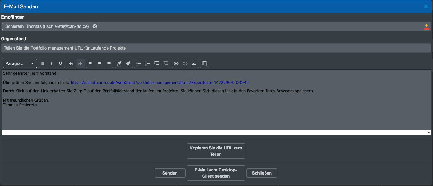 Image: An e-mail is sent from the software containing the link for the control center.
There are different perspectives on the digital world of all a company's projects, people and work. That's why there are also different control stations - depending on what information is required.
The most popular representation is a chronological representation of the portfolio in the so-called Gantt chart, i.e. as a bar chart. This shows all projects with the current progress, the risks (red lamps) and the expected end date.
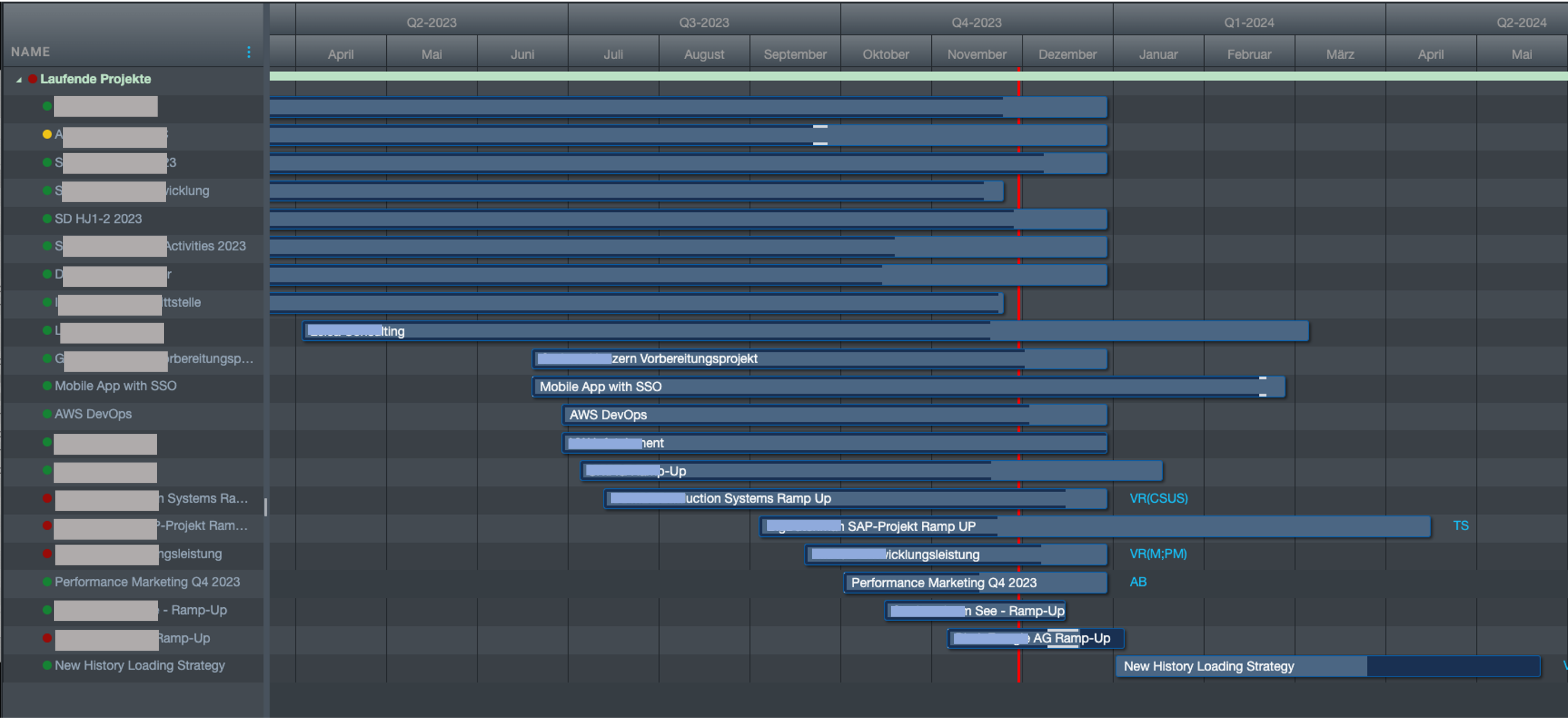
Image: Control center in the Gantt view
There are separate targets for each project. The lamps on the far left show the risk status calculated by the system. The red vertical line is "Today". The progress of the project is shown by the blue lines at the edges of the bars.
This bubble chart shows the risk of the project failing on the x-axis. The score (benefit) is shown on the Y-axis (in this example, the benefit can also be negative). The diameter describes the total cost of the project.
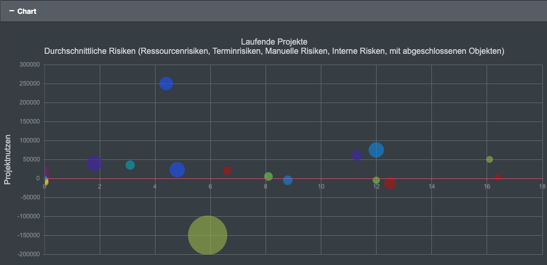
Image: BubbleChart. Normally the project names are also displayed in the graphics, but this has been hidden here.
Updated tables also provide an overview; here is an example:
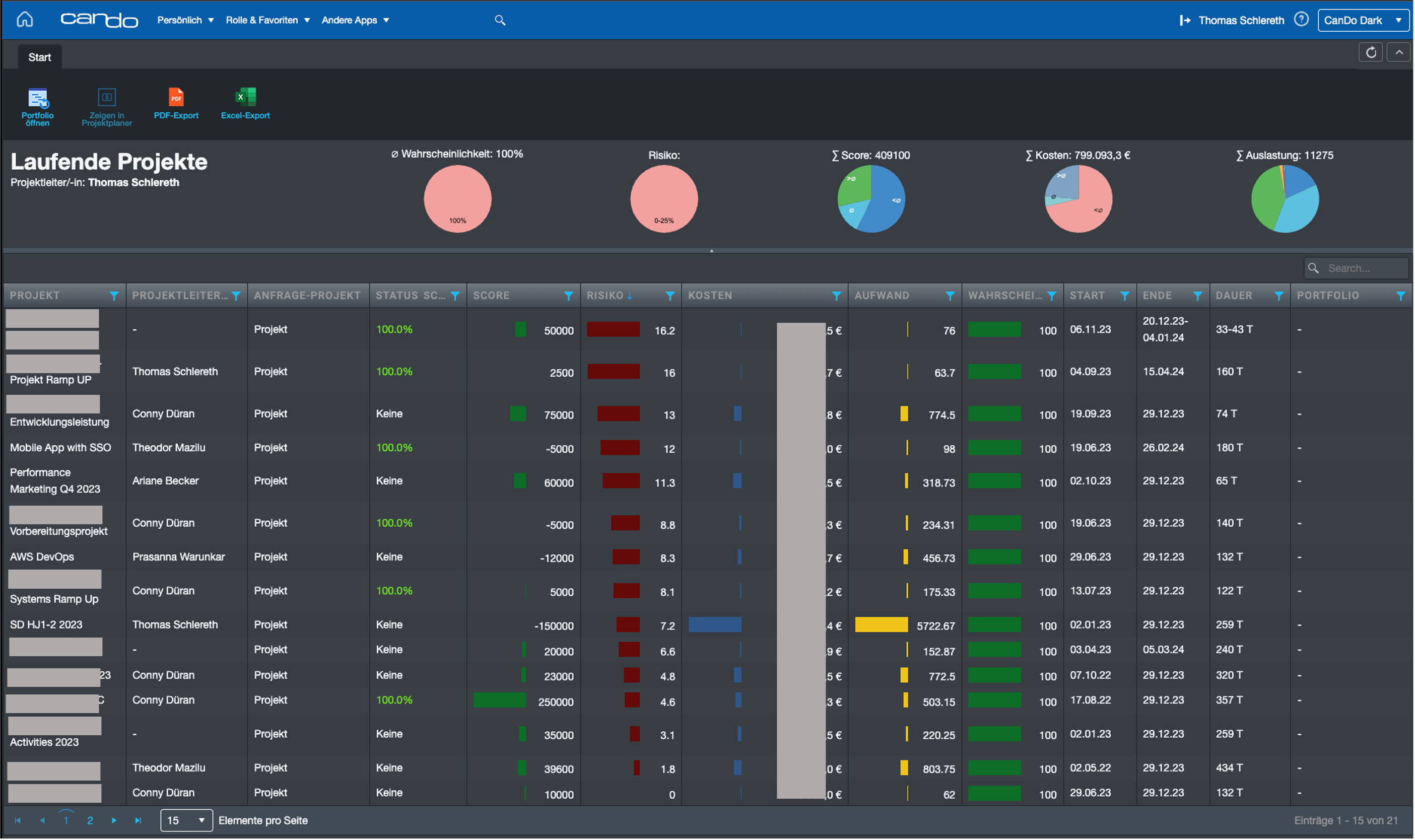
Tabular presentation of all projects in a portfolio, projects with the highest risks first.
A control center therefore differs from reports and dashboards in that it always provides information in real time and often remains open at all times. The most important point, however, is that decision-makers can call up this data whenever they want, making cyclical reporting obsolete.
As a member of the management board, Thomas is responsible for the operative management of the development including conception, design and further development of the software. He also advises customers on best practices and supports the roll-out.
1 min read
We are really pleased to present the further development of role- and skill-based planning in Can Do. The topic has...
Change Requests Are Part of Everyday Project Work – In Our Team Just as Much as With Our Clients
In many workshops or...
Decisions have to be made constantly in project and resource planning. What happens if an important project starts...