1 min read
Role- and skill-based planning: New features in Can Do
We are really pleased to present the further development of role- and skill-based planning in Can Do. The topic has...
.png?width=200&height=80&name=CanDo%20Logo%20transparent%20(500%20x%20200%20px).png)

A burn down chart shows graphically how the planned work becomes less and less towards the end of the project. At the top left is the total amount of work planned in the project and at the bottom right is the "zero". Based on the actual planning, this new app now shows week-by-week how the work is getting less and less.
Since Can Do automatically corrects the work according to the actual time based on real hours and completed packages, an actual progression is visible.
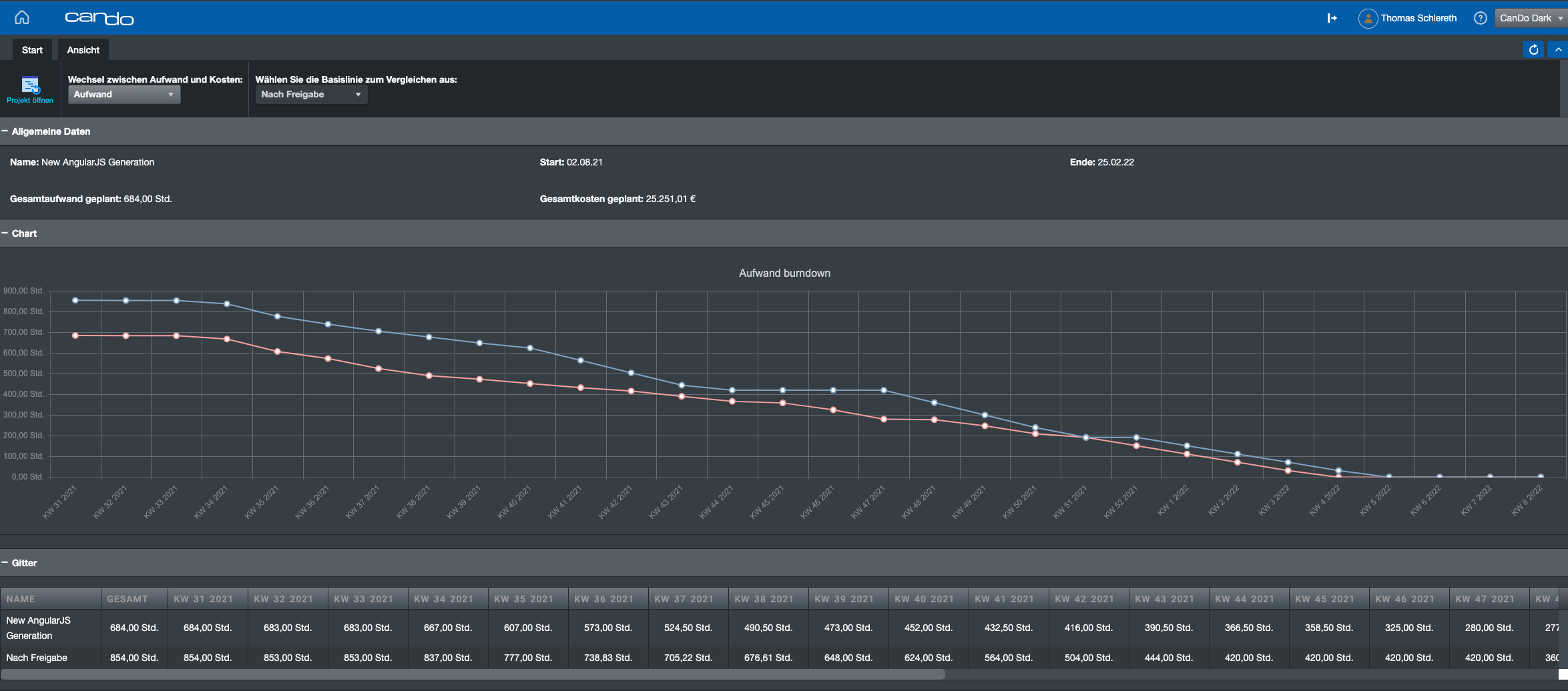
The line is particularly useful when compared with the so-called base plan, i.e. the frozen original plan.
In the graphic you can see how the course was originally planned (blue line) and the actual course (red line). It is easy to see that at the beginning of the project less work was done than originally planned. Afterwards, the gap becomes smaller (from week 49) but still remains behind the basic planning.
We have added a table with the values below. We'll add a third line to that with the gap per week.
The app will be released in standard in January for cloud users and during the first quarter of 2022.
As a member of the management board, Thomas is responsible for the operative management of the development including conception, design and further development of the software. He also advises customers on best practices and supports the roll-out.
1 min read
We are really pleased to present the further development of role- and skill-based planning in Can Do. The topic has...
Change Requests Are Part of Everyday Project Work – In Our Team Just as Much as With Our Clients
In many workshops or...
Decisions have to be made constantly in project and resource planning. What happens if an important project starts...